

Executive Summary
HAMD AI entered the project without an established visual identity. PakAmGlobal’s Creative Services team was brought in to turn an early-stage healthcare technology concept into a clear, credible, and ownable brand identity.
The work began with hand-drawn exploration and moved through symbol development, digital iterations, logo configurations, typography, and color selection. The result is a flexible identity system built around a distinctive cross-like symbol and a visual language that balances healthcare, artificial intelligence, connection, and human assistance.
THE CREATIVE OBJECTIVE
Create a healthcare technology identity that feels intelligent and innovative without losing trust, clarity, or the human element.
01 Brand Context & Challenge
What is HAMD AI?
Within the supplied project materials, HAMD AI is positioned as an AI-focused healthcare brand operating at the intersection of artificial intelligence and healthcare. The identity is intended to communicate a modern, innovative, and accessible approach to healthcare powered by AI.
The brand is presented as HAMD AI with the supporting descriptor “HealthAssistMD,” establishing a clear connection between AI-enabled technology and healthcare assistance.
The Challenge
The project started from a blank visual canvas. HAMD AI needed an identity that could make the relationship between healthcare and AI understandable while avoiding generic technology clichés.
- Communicate artificial intelligence and technological capability.
- Build trust and credibility appropriate to a healthcare context.
- Balance advanced technology with a human-centered feel.
- Create a distinctive symbol that can become recognizable over time.
- Build a flexible system for digital and physical brand touchpoints.
Strategic Creative Direction
PAG treated the assignment as a brand-building exercise rather than a standalone logo task. The creative direction centered on five connected ideas: intelligence, trust, innovation, humanity, and flexibility.
CORE BRAND IDEA
Technology that feels human — a visual identity where healthcare recognition and AI innovation can coexist in one clear system.
02 — From Exploration to Identity
The identity was developed through a structured progression: exploring the visual territory by hand, testing and refining digital directions, and building a usable identity system around the selected concept.
03 — Discovery & Sketches
The process began with hand-drawn exploration. We studied the medical cross as a recognizable healthcare foundation and explored how its structure could also communicate AI, people, connection, support, care, and smarter living.
Multiple geometric and dimensional studies were used to test proportion, balance, negative space, symmetry, and the relationship between the central element and surrounding forms. The exploration stayed intentionally broad before narrowing toward the strongest visual language.
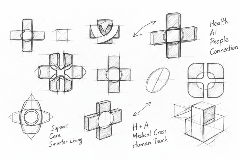
Early concept studies exploring healthcare, AI, people, connection, support, and human touch.
What the exploration established
- The medical cross offered immediate healthcare recognition.
- Rounded geometry introduced a softer, more approachable character.
- The central element became an opportunity to express connection and assistance.
- Geometric construction created a foundation for consistency and scalability.
04 — Logo Development
The strongest sketch directions were translated into a series of digital logo concepts. The focus shifted from idea generation to refinement: simplifying forms, improving proportion, testing negative space, and evaluating how the central element interacted with the four surrounding shapes.
Blue and blue-to-teal treatments were explored to find the strongest balance between healthcare recognition and a technology-forward visual character. The iterative set helped establish which concept could become an ownable and adaptable master mark.
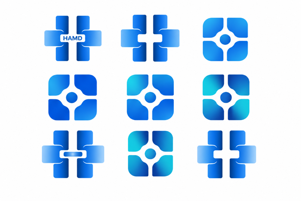
Digital logo iterations — refining geometry, central connection, proportion, and color direction.
Design principles
- Clear silhouette for fast recognition.
- Rounded forms to soften a technical aesthetic.
- Central connection point to reinforce relationship and assistance.
- Controlled geometry to support consistent reproduction.
- Color exploration to balance trust with innovation.
05 — Final Logo
The selected direction became the HAMD AI master identity. Four rounded forms create a cross-like foundation around a central connecting element, combining a familiar healthcare cue with a contemporary technology expression.
The central form links the surrounding shapes and supports the broader ideas of connection, intelligence, and human assistance. The resulting mark is clean, modern, and designed to remain recognizable across different sizes and applications.
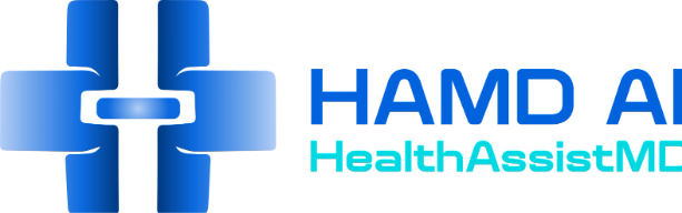
Final HAMD AI identity — a cross-like symbol built around a central connecting element.
IDENTITY MEANING
Healthcare + AI + Connection + Human Assistance — expressed through a simple geometric system rather than a literal technology icon.
06 — Logo System, Typography & Color
Logo Variations
A strong identity needs to work beyond one preferred lockup. PAG developed three core configurations: stacked, horizontal, and icon-only. This gives HAMD AI practical flexibility across websites, presentations, social media, mobile interfaces, stationery, and other communications.
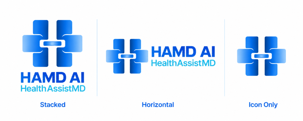
Three core configurations: stacked, horizontal, and icon-only.
Typography
The supplied identity board specifies Quantix as the selected typeface direction. Its modern, geometric, clean, confident, and digital-ready character supports the technology positioning while keeping the wordmark straightforward and contemporary.
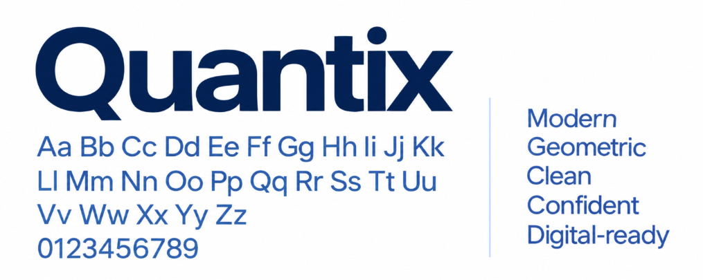
Selected typography direction: Quantix — modern, geometric, clean, confident, and digital-ready.
07 — Color System
The color direction uses contemporary blues with a complementary turquoise family. Blue establishes trust, technology, clarity, and professionalism; turquoise introduces a more progressive and human healthcare character.
The supplied identity board also demonstrates light, normal, dark, and deeper states, creating a color system that can extend beyond the logo into digital interfaces and physical brand applications.
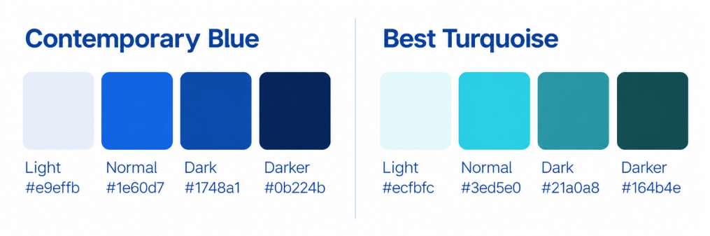
HAMD AI color system — contemporary blue and complementary turquoise directions.
Why the palette works
- Blue supports trust and healthcare credibility.
- Darker blue provides authority and contrast.
- Turquoise introduces energy and a progressive digital feel.
- Multiple tonal states improve flexibility across interfaces and collateral.
08 — Bringing the Identity to Life
The identity was considered as a system rather than a logo in isolation. The supplied case-study board shows the visual direction extended into brand applications, including stationery, environmental branding, mobile presentation, and a website interface.
What PAG Delivered
- Brand discovery and creative direction
- Hand-drawn concept and symbol exploration
- Custom logo development from scratch
- Digital logo refinement and finalization
- Stacked, horizontal, and icon-only configurations
- Typography direction
- Color system direction
- Foundation for future brand and marketing applications
The Impact
For an emerging healthcare technology brand, a clear visual identity creates a foundation for consistent communication. HAMD AI now has a recognizable visual starting point that can support digital channels, presentations, marketing collateral, product interfaces, and future brand expansion.
The project demonstrates PAG’s ability to take an early-stage idea, translate its strategic themes into visual language, and develop that language into a practical identity system.
09 — Beyond the Logo
At PAG, Creative Services is not limited to producing attractive visuals. We help organizations translate ideas into clear, distinctive, and market-ready brand systems.
For HAMD AI, the process started with a blank canvas: sketches, questions, iterations, and visual experiments. It evolved into a complete identity direction designed to communicate healthcare, AI, connection, and human assistance with clarity.
About PAG Creative Services
PakAmGlobal Creative Services helps organizations transform ideas into clear, distinctive, and market-ready brands. Our capabilities include Brand Identity, Logo Design, Creative Strategy, Digital Design, Marketing Collateral, Social Media Creative, Presentation Design, and Visual Systems.
Whether you are launching a new company, repositioning an existing brand, or building a new product, PAG combines creative thinking with business understanding to develop visual experiences designed for growth.
READY TO BUILD YOUR BRAND FROM THE GROUND UP?
Let’s create an identity that moves your business forward.
READY TO BUILD YOUR BRAND FROM THE GROUND UP?
Let’s create an identity that moves your business forward.